
Many Ways to Right

Vaune with a finished print that’s “right”
By Geoffrey Peckham
Vaune Trachtman’s presence in Tusen Takk’s etching studio over the past four weeks has been a true joy. She leaves the day after tomorrow and this place is better for her having been here. During her stay I learned an important lesson about making art (truly, about making anything). I’d like to pass it on to you because it’s one of those things that can only be learned from a person like Vaune, someone who engages their whole heart, mind and soul in the creative process.
Several times over the course of Vaune’s time here in the studio I heard her say, “There are many ways to right.” That’s it. That’s the perspective that changes everything.

Vaune and Tom pulling a very large print on the etching press

The finished print
I need to give you a view into what’s been going on in the etching studio these past four weeks because it’s an art-making process that’s not practiced in many places and explaining it will help you to understand what Vaune means by this phrase, “There are many ways to right.”
What we’re making are photopolymer photogravures. A short description of the photopolymer photogravure process is that we’re putting a photographic image on a plate that is then etched, covered with ink, placed on an etching press and squished under a 400 lb. steel roller so the ink transfers onto paper. Like many art-making processes, photopolymer photogravure requires an intimate knowledge of a lot of things. In our case this includes the intaglio process of transferring ink from plate to paper, photography, and digital printing. One of the things that’s most interesting here is that these three technologies were invented over a span of 600 years: from the 1430s when intaglio printing was developed in Germany, to the 1840s-1850s when Henry Fox Talbot invented the negative/positive method of photography, to right now, when new, safe methods of making photogravure plates are being invented by a handful of artists using digital images, inkjet printers, and sensitized metal plates. When done with passion and skill (and some dumb luck), the end results are ink images on paper that defy description they’re so beautiful.
The nuts and bolts of this process are intricate; they can be written down and followed but what determines the qualities of the final image is felt more than defined. What I mean by this is that you can’t really follow a rule book and know ahead of time how things are going to turn out with this process. Instead, you must feel your way through it, which makes the end result a product of intuition and sensory experience more than data-driven technique. I’ll try to explain.
First you choose an image you think will translate well in photogravure. Not all images are suited for ink impressed on paper. Only you can determine what you think will work which means you need to think about what you’re after, meaning the expressive content of the final work. I’ve come to understand from Vaune that choosing the right image has a lot to do with the picture’s tonal range and how that tonal range will look with a specific color of ink on a specific color and texture of paper. The tonal range of the image (meaning its blacks, mid-tones and highlights) will be compressed by this process - the image won’t look like the vivid transparent image that appears on your computer screen; it will look like ink on paper - a reflective surface with a weave to it. Thus, choosing the image and imagining it differently is the first step.

Vaune choosing an image
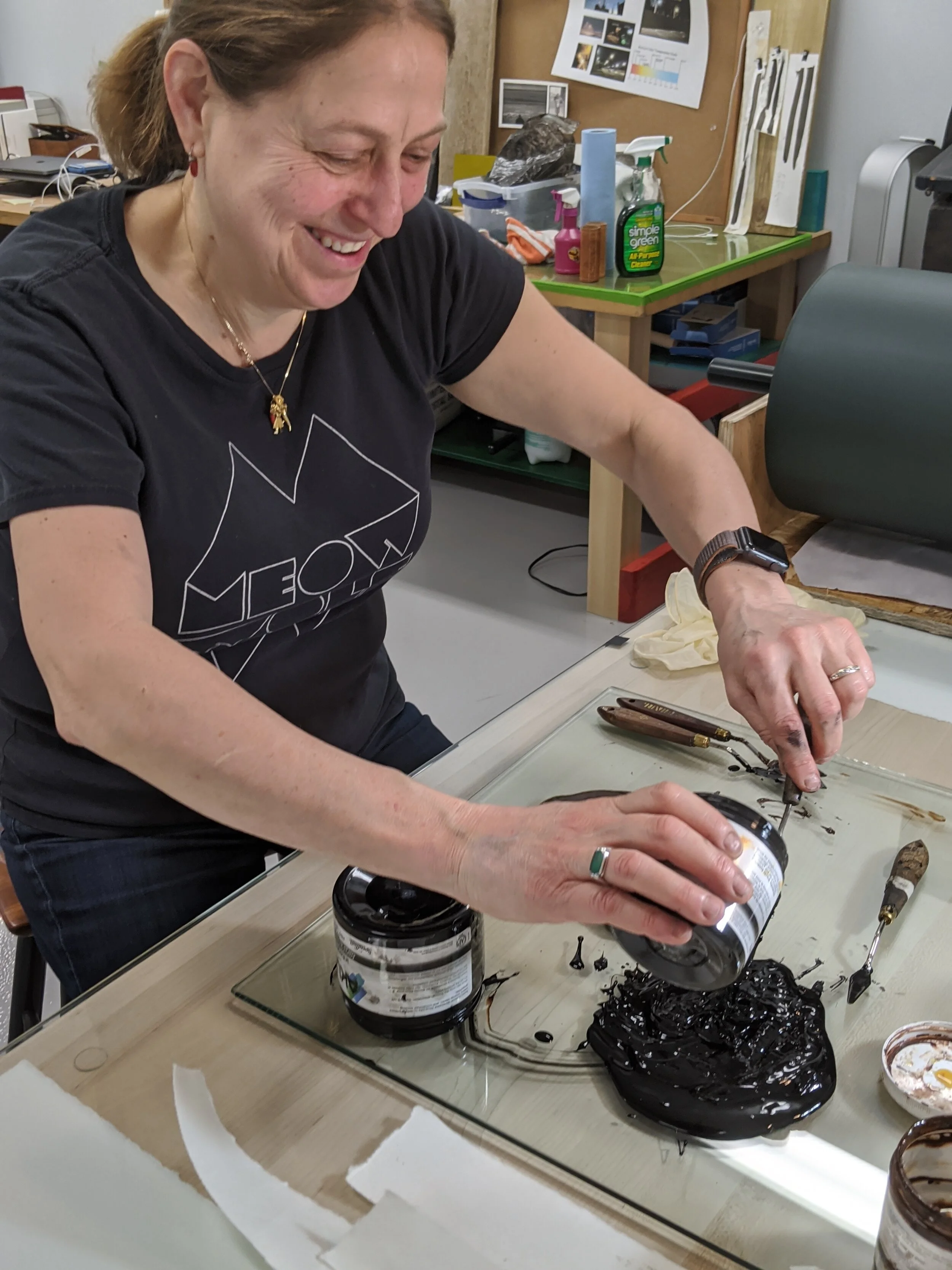
Mixing ink
Next you prepare your ink by choosing the right shade of black ink and placing a glob of it on to a sheet of glass. There’s a large range of colors of black ink available, both oil-based and soy-based. You need to feel partial to one ink over another: cool black vs. warm black vs. neutral black (which means blue black vs. brown black vs. neutral grey black). Sometimes as you work the ink on the glass with a pallet knife, flipping daps of it over and over again onto itself. You may feel that the ink is too stiff. When that happens you add transparency - amber-colored greasy stuff that adds viscosity (slipperiness) to the ink. Adding a dab or two (or three or four) will make the ink feel more slippery. But you don’t want it to be too slippery. Having the proper ink viscosity can mean the difference between an image beautifully impressed on paper and a messy inkblot more suitable for psychological testing (e.g. “What do you think this is?”). The right degree of slipperiness is something that’s felt with your wrist, you hand, and your arm as you mix your ink.
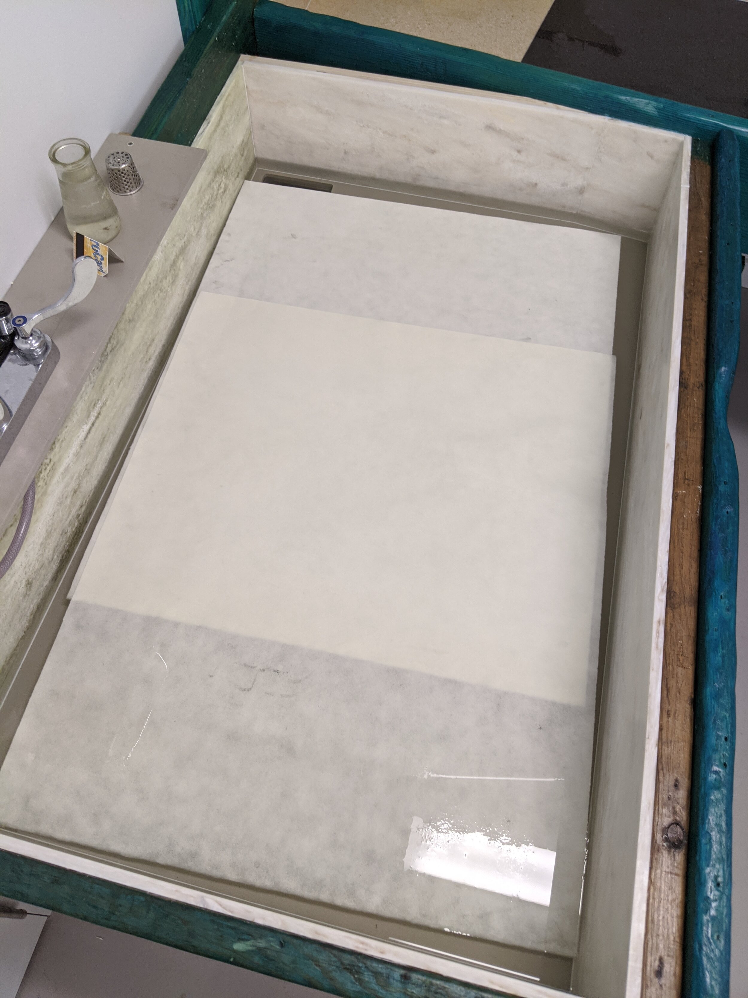
Paper soaking
I forgot to mention that while you’re mixing up your ink you’re also soaking your sheet of paper in a tray of warm water. In the photogravure process, ink sticks to damp paper better than it sticks to dry paper. Soaking the paper also removes some of the sizing that makes paper stiff, and suppleness in the paper is good for printing too. One of the first things you learn when you’re introduced to printmaking is that there are more types of paper to choose from than breeds of dogs in the universe. And choosing the right paper is critical; it’s color, smoothness, weave, and receptivity to ink all work together to determine the way your images will appear. The trick to soaking paper is doing it for the right amount of time. What’s the right amount of time? Well it depends on the paper, the humidity of the room, and the temperature of the water. The only way to know is to remove the sheet of paper from the water bath, place it on a towel, pat it a bit, press it to your cheek (or to the back of your hand - the back of your hand is more sensitive than your fingers) and feel it to judge whether it’s the right amount of damp. If it’s too dry, the ink won’t transfer very well to the paper when it goes through the press. If it’s too wet, the ink will smear. Developing a “sense history” of feeling damp paper and seeing what the image looks like coming off the press will give you the ability to say, “Yes, this paper is just the right amount of damp.”

A plate being made on the flipped-on-its-side” Epson printer
The technical side of creating a photogravure plate with an Epson printer is as humorous to me as it is technically challenging. To put it bluntly, the photopolymer photogravure process takes everything I’ve learned about digital printing over the past forty years and turns it on its side. And when I say turns it on its side, I literally mean turns it on its side. The metal plates we’re using at Tusen Takk are so large that the vacuum suction of the Epson printer is not strong enough to hold the plates as they go through the printer - halfway through printing they fall out onto the floor, an expensive waste of what could have been a beautiful plate. On the advice of my good friend Jon Cone, printmaker extraordinaire, we flipped one of Tusen Takk’s 44” wide multi-thousand dollar super-sophisticated Epson inkjet printers on to its side and chocked it in place with some 6x6 blocks of wood I found on the beach. Now the plates go through the digital printer horizontally, not vertically; and they no longer fall onto the floor. Thank you Jon! Who thinks of these things? Only crazy brilliant people.

The Epson inkjet-printed plate going into the platemaker to be exposed to UV light
With the plate printed, it now gets exposed to UV light in a platemaker, washed with water, and dried. Presently we’re using a 40-year-old 800 lb. monster platemaker I bought from a printer in Philadelphia a year ago and lowered down into the etching studio with a one-ton hoist. The determination of how much UV light to use to expose the plate is all about knowing how much of a “bite” (depth of etch) you want in your plates. The depth of the plate’s etch is what determines how much ink will be held in the plate after you’ve wiped it - and this determines the tones that will be reproduced in your final print. Vaune made test plate after test plate at various light intensities and times to figure out how her chosen paper, ink and images will look best with plates made with this platemaker. But there’s more; the end result, the print, is also affected by the temperature, humidity and airflow of the space you’re in - meaning the warmth of the printing press bed, the warmth of the press’s steel roller, the paper’s dampness, the humidity in the air, the viscosity of the ink on a warm (or cold) plate, and the amount of pressure the press’s roller transfers through the press’s felt blankets to the paper that’s laid on top of the inked plate - which all must roll smoothly under the weight of the press roller as the operator carefully turns the crank handle that moves the press bed (which was done mostly by Vaune, a couple of times by Tom or me). All of these things affect how ink goes on paper.

Several days’ and nights’ work (photo by Vaune Trachtman at 4 am)
So many variables. Change any of them and things will look differently. Now you can begin to understand what leads Vaune to say, “There are many ways to right.”
Vaune has taught me that the key to the whole process of finding your way to “right",” to making art, is to trust your feelings about what’s right and then be generous with yourself. It takes time and curiosity to figure things out; curiosity to keep going after you meet with failure, curiosity to change things and try again. Eventually you’re going to get to where you want to be - a place you call right. Once you’ve found how to get there, to this personal sense of what’s right, then you go full steam ahead! Vaune worked out all the variables of the Tusen Takk studio over the course of her first two weeks here, and these last two weeks she’s been spending long days and late nights making prints (late enough to see a full moon rise and set over Tusen Takk’s studios).

Vaune’s photograph of the moon rising over the painting studio at 3:00am

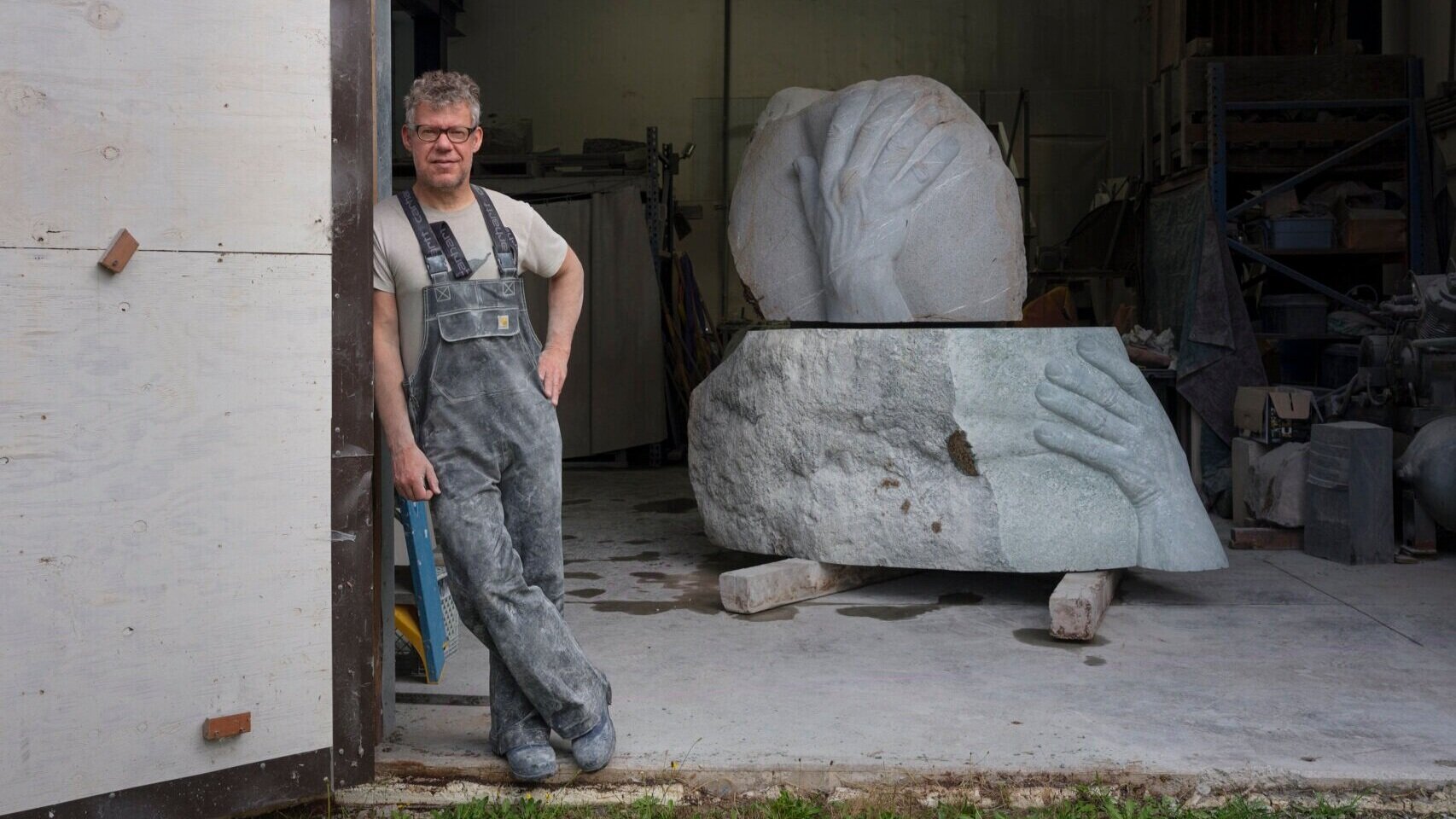
Dan Webb with the “Precarious Yes” sculpture mounted in Tusen Takk’s Guesthouse.
One more thing. Several times as Vaune inked, wiped and printed her plates I heard her say, “It’s going to be beautiful.” That generous spirit is essential. It’s like the sculpture Dan Webb carved while he was here at Tusen Takk in January, the sculpture that’s placed inside the artist residence on a narrow wall that you see when you come out of the painting studio; it spells the word “YES.” This beacon reminds you to say “yes” to yourself as you make things like sculptures, images, books, and music. Be generous to yourself. Allow yourself to love your processes. Enjoy feeling your way to what’s right…and it will be beautiful.

Featured Artist
Featured Artist